


Religiosity index shows the changes in religious activity in the United States.
An update through 2013 is now available here.
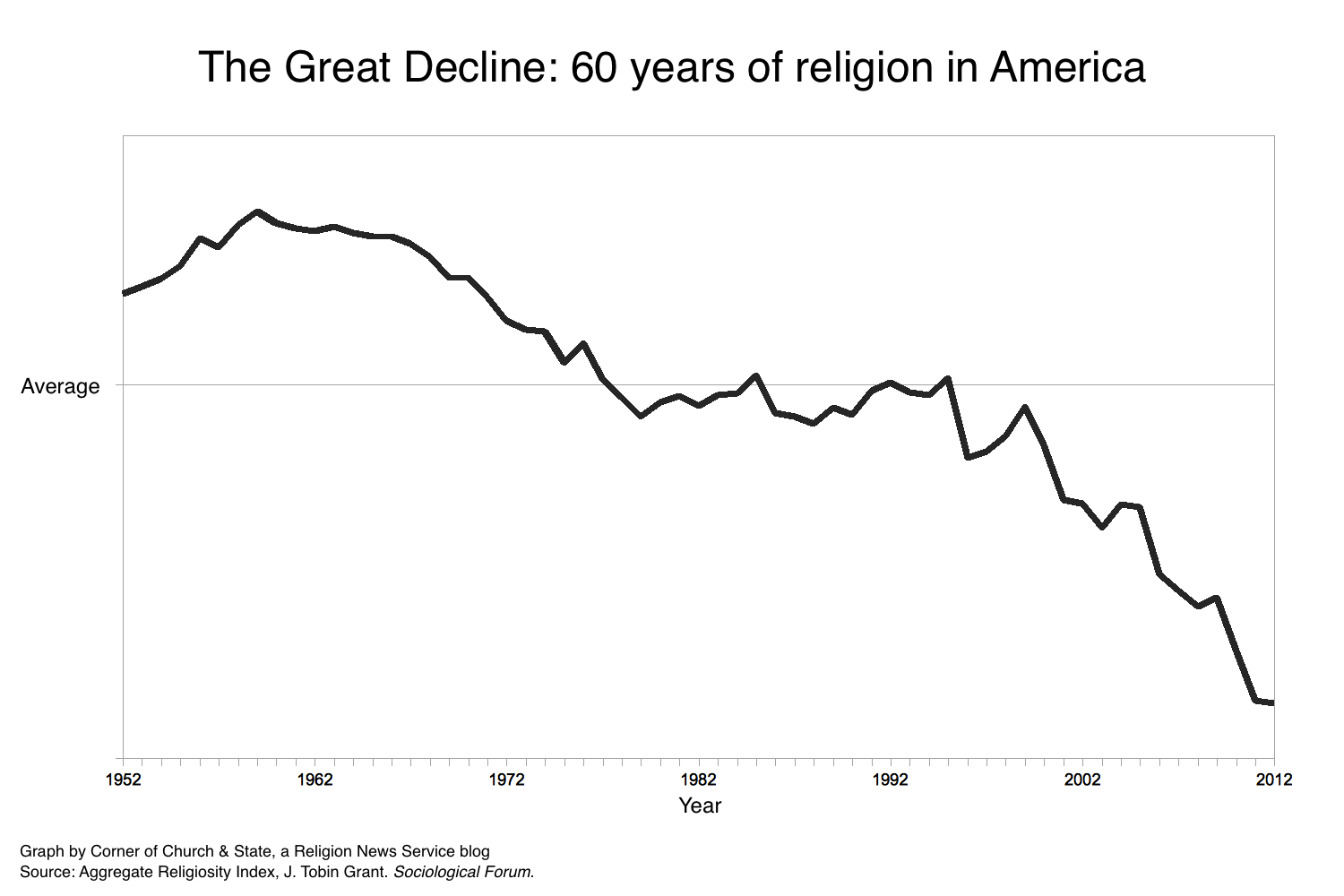
Religiosity in the United States is in the midst of what might be called ‘The Great Decline.’ Previous declines in religion pale in comparison. Over the past fifteen years, the drop in religiosity has been twice as great as the decline of the 1960s and 1970s.
How do we track this massive change in American religion? We start with information from rigorous, scientific surveys on worship service attendance, membership in congregations, prayer, and feelings toward religion. We then use a computer algorithm to track over 400 survey results over the past 60 years. The result is one measure that charts changes to religiosity through the years. (You can see all the details here).
The graph of this index tells the story of the rise and fall of religious activity. During the post-war, baby-booming 1950s, there was a revival of religion. Indeed, some at the time considered it a third great awakening. Then came the societal changes of the 1960s, which included a questioning of religious institutions. The resulting decline in religion stopped by the end of the 1970s, when religiosity remained steady. Over the past fifteen years, however, religion has once again declined. But this decline is much sharper than the decline of 1960s and 1970s. Church attendance and prayer is less frequent. The number of people with no religion is growing. Fewer people say that religion is an important part of their lives. All measures point to the same drop in religion: If the 1950s were another Great Awakening, this is the Great Decline.
Geek note: Because the index is a combination of different measures with different scales, the index produced by the algorithm does not have a specific scale. In this graph, the average level for the time period is indicated. The top of the graph is two standard deviations above the average; the bottom is three standard deviations below the mean. Differences between two points can be compared with differences between two other points, e.g., the difference between the 1960s and 1980s is a decline of about 1.5 standard deviations, but the difference between the late 1990s and 2012 is nearly three standard deviations.